Atlantic Business Technologies, Inc.

Category: User Experience

  • Proven UX Research Strategies For a Strong University Website

    A university website must provide an informative, engaging user experience (UX) as they court prospective students. Dependable research is key to designing an effective UX. When planning for a university website project, you need to decide how you will approach both user research and feedback throughout the development cycle. It isn’t rocket science, but it does rely on critical thinking and crafty planning.

    In this article we will review sample plans that can help guide your user research. But make no mistake: There is no such thing as a one size-fits all research plan. Decide which strategies to pursue based on your objectives, project scope, and what resources you have available.

    Example Plan 1: University Website Redesign

    Your biggest UX challenge for the website redesign will likely be the sprawling business needs of the university. While most schools operate on an altruistic mission, that mission is fueled by stakeholder buy-in, marketing success, and brand awareness. These goals help ensure the success of a school but consider: are business goals equatable to the goals of the website?

    venn diagram of content on a university homepage versus what people are looking for
    The classic UX divide of the university homepage.  Source: xkcd.com

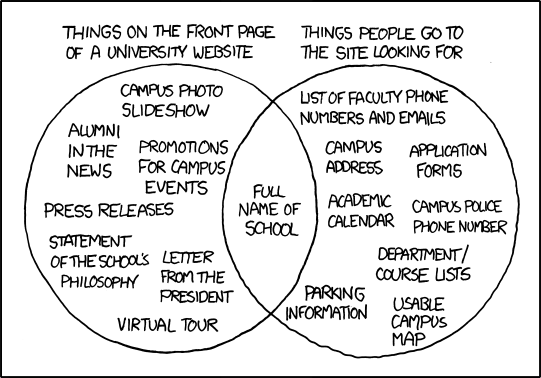
    I love the above XKCD panel that illustrates implementation vs user needs. It captures the heart of the problem: universities often tailor their web content to promote themselves, which results in regular users struggling to find the content they need.

    Balance business and user needs by regularly sharing user data with stakeholders. This will build empathy and keep your project on a user-centered track. Another project goal will be to make sure certain parts of the site (such as requests for information or scheduling a campus visit) are easy to locate and understand.  Prioritize users who are interfacing with your brand and services for the first time. What’s good for the novice is often good for the expert. Let’s move onto the research plan.

    Website Research Plan at a Glance

    Project TypePhaseResearch Methods
    University WebsiteDiscoveryStakeholder workshops


    Card sorts

     Design5 Second tests
     Post-launchFeedback evaluation

    University Website Redesign – Discovery Phase

    Stakeholder Consensus Workshops

    If there are multiple agencies, programs, or departments represented on the project, then plan for a stakeholder workshop to gather vital information about various needs and beliefs. The activities in this workshop might include a Q&A or user persona creation. Our team has had great success with moderated brainstorming, and affinity mapping activities. The purpose of these exercises is to build the overall mission of the project. Use the activities to keep the conversation focused on what needs to be conveyed to visitors and what actions to encourage.

    [Affinity Diagrams are groupings of stakeholder ideas to identify patterns, themes, and priorities]

    You may hit some political bumps—but don’t worry! It’s far better for this conflict to happen early in the project rather than right before launch. Use this as an opportunity to build trust and understanding with your important stakeholders.

    Card Sorts

    University websites have a large variety of content, meant to reach several audiences. Set aside time for your information architecture and content strategy. Perform a card sort of your information designs with representative users and pay close attention to the results. These tests are best done in person. You can gather qualitative comments by asking questions and encouraging your participants to think out loud. Caution: this activity is meant to smooth snags in the overall fabric, not statistically represent users as a whole. Don’t let a thoughtful user comment pass you by, but also be careful not to redirect the project to suit the needs of a single participant opinion.

    University Website Redesign – Design Stage

    5 Second Tests

    Plan for some type of regular design feedback. Try a 5 second test, which shows a user the design for 5 seconds and then asks them questions about their perception of the design. This will help you and your design team understand how clear your primary messages are.

    Here are some great questions to ask after exposing them to a single page design:

    • Describe the page you just saw.
    • What is the purpose of this page?
    • What are some actions you could take on this page?

    Of course, you can get a lot more specific depending on the page’s contents and what you hope to learn. These tests are straightforward, inexpensive to perform, and can yield fascinating results. Don’t overthink it!  With a small sample size, you might end up with a wide variety of results—but these honest and unbiased reactions from real users are pure gold to researchers. Put the right amount of emphasis on the results and have fun learning!

    University Website Redesign – Post-Launch Phase

    Intercept Surveys

    In my humble opinion, I think people spend way too much time deciding which feedback widget to add to their site and not enough time thinking about the data it will generate or how they will use that data in the future. Plan your surveys to catch your users at a crucial point in their journey with your university website, like after submitting information requests. This type of “intercept survey “ will help you make better assessments about needs and behaviors. But be careful—this survey isn’t simple analytic code that you can slap down and forget about. Like all research initiatives, it requires deliberation and attention.

    Use feedback surveys dedicated to ongoing evaluation and have confidence about the research question you’re asking. Keep in mind that we are all over-surveyed and under-rewarded. Your users are no different. Be brief and meaningful with your survey, letting the users know how their effort is benefiting a larger community.

    Example 2: Student/Faculty Resource Portals

    An online/resource portal on a university website is accessed by a captive group of dedicated users who are determined to complete their task. This single fact should drive your entire perception of its design. Personally, I find this type of UX research particularly exciting.

    For the purpose of this blog we will say that a resource portal is: A view that serves as a hub to resources that student or faculty members need to fulfill their vocational role.

    Because portals are able to complete a wide variety of tasks, they can suffer from poor organization. And—since each portal is different—comparing them to similar systems will only take you so far. It will be crucial to understand user motivation and high-level goals in order to develop a resource portal that is simple and accessible.

    User research is at the heart of this journey. Spend time getting to know the motivations and struggles of your user segments and the rest of the resource portal project will run smoothly.

    Research Plan at a Glance

    Project typePhaseResearch Method
    Student/Faculty Resource PortalDiscoveryScenario Identification
     DesignPrototype Testing
     Post-launchSummative Evaluation

    Resource Portal – Discovery Phase

    Scenario Identification

    Begin by listing out all the scenarios that would bring a student or faculty member to your university website. If you are interested in learning how to identify new needs, gather feedback from users themselves to prioritize those items. There are many ways to do this, either with stakeholders or by gathering the information with a card sort or survey.

    This simple activity is critical to building a meaningful resource portal. Once you have a prioritized list of real-life scenarios, it will be easy to dig into the user’s goals, tasks, and expectations. From there, you and your team will be poised to create a rough prototype inspired by your informed assumptions.

    Resource Portal – Design Phase

    Paper Prototype Testing

    For a project as important as a user resource portal, I recommend testing your concepts as soon as possible. Consider a paper prototype test. Create a prototype of your concepts with whatever materials are available to you (such as paper drawings or print outs). The only requirement is that your objects embody the ideas of your design team and project stakeholders.

    Explain the prototype to the user and ask them questions about how it works. Allow them to remove/add/change elements and explain their motivation. This last point is important! User motivation is more meaningful than the actions they take. As you perform these tests, record and report how users expected to complete the task. This will take more critical thinking than you might expect. We call these activities “participatory design”. It is sure to energize your team and give incredible purpose to your design decisions.

    Resource Portal – Post-Launch Phase

    Remedial Usability Evaluation

    While you may be tempted to focus solely on page analytics or help desk requests, I highly encourage project sponsors to re-evaluate the entire system and make sweeping changes to elements that aren’t working. It’s much cheaper to nurture and grow a system over time than it is to engage in redesign overhauls every 2 years.

    For remedial efforts, have a handful of users participate in usability testing sessions and work to minimize problems that may have developed over time. Should problem areas arise, you can take a focused look at those elements and refine the system.

    Conclusion

    Ultimately, higher education UX research has much in common with a great university experience: the learning process is ongoing and there are tons of study options. Because there are dozens of ways to gather valuable user feedback that will help refine your project vision, it is best to approach UX research with your goals in mind.

    Maintain a birds-eye view of the project’s desired outcomes, and you will be better-prepared to implement your research. Choose methods that will work to establish consensus among key team members and will uncover the most valuable insights to help answer your questions. You’ll have to be clever to pull off great design research, but that cleverness will set you apart from the pack as a caring and enjoyable brand to engage with.

  • How WordPress Empowered Campbell’s Higher Ed Brand

    Ask any brand marketer why brand consistency is important and you’ll get a variety of answers. Most boil down to how a consistent brand allows you to convey your values, manage perceptions, and grow within a framework. When your brand or messaging is inconsistent, there can be an erosion of trust or confidence from your audience. Over time that results in negative returns from any promotional efforts—which is why more and more higher education institutions are taking branding seriously.

    66% of colleges have spent more than $100,000 on brand strategy development.

    The Chronicle of Higher Education

    Beyond the creative challenges associated with higher ed branding, there are significant technical hurdles to portraying a united brand on a university website with multiple programs and schools. That in mind, this blog post will use my company’s recent collaboration with Campbell University as a working example of how we overcame the technical roadblocks in Campbell’s way. We met the issues Campbell University faced with WordPress’ multi-site installation to give Campbell the digital platform they needed so they could freely focus on performing their best brand work.

    Campbell University and the Need for a Shared Framework

    First, some background about Campbell University’s legacy site: the university had a website for their main campbell.edu property, and each individual school at Campbell. The central Marketing Communications (CMC) team had limited influence over the content produced by each school and whether it complied with Campbell’s branding or not.

    Legacy site for the Campbell Law School
    Notice the differences between the sites for Campbell’s Divinity and Law Schools. We needed to unify the brand look across Campbell’s schools and programs.

    Legacy site for the Campbell Divinity School

    As you might imagine, this led to a confusing user experience because the look, feel, and tone of a Campbell.edu page could change substantially as you navigated across school sites. Campbell University’s Assistant Vice President of Communication and Marketing, Haven Hottel, described the legacy campbell.edu as “disjointed”:

    “The site was a collection of independent websites connected to a central university site. Beyond the top level, there was little visual and navigational consistency; two of our colleges and schools operated outside of the current CMS; and there was not a clear URL naming structure.”

    As Campbell’s partner for their site redesign, we wanted to change this situation by balancing university governance with empowering stakeholders across Campbell. This meant changing the web environment from every department having their own tool to everyone having a shared framework from which to produce content for their schools—content that had a universally-branded look and feel.

    The key to accomplishing this was a multi-site installation of WordPress. We built each school’s property as their own website within the global campbell.edu domain. This allows each of them to have their own space to produce content, style their pages, and generally retain the control they wanted. As for the CMC team, they are now able to utilize user permissions and workflows for content production within WordPress. This helps achieve their goals for content production and brand integrity. Now they can review and provide direction for all the content their stakeholders produce as well as how pages are styled going forward.

    Chart of user roles and privileges
    By enabling content managers across Campbell to designate user roles and privileges, we helped university stakeholders contribute to their branded sites without going off-brand.

    This shared framework has brought together the CMC team and the content producers at the schools in a new way, and sets Campbell up for success going forward. The results so far have been on par with the original intention: freedom for all to contribute, but within the framework of the core brand.

    How We Set Campbell Up for Brand Success on WordPress

    Campbell’s client profile is unique. The CMC team planned to own the whole website and brand ecosystem going forward and support it for their constituents—the schools. Within this atmosphere, there were a number of objectives we wanted to achieve throughout the life of the project:

    • Position the CMC team as the project lead to their constituents.
    • Incorporate the CMC team as a part of the ABT team in all facets of production.
    • Give them the knowledge base needed to move forward.
    • Help secure traction at the highest levels of the university for the initiative.

    To achieve these objectives, we created processes and played roles newer to ABT. One process we implemented was “tearing down the wall” between the client and project teams: the CMC team were at our office weekly for all-day working sessions, participated in our huddles, reviewed work-in-progress, created some designs, and generally worked together with our experts all throughout the lifecycle of the project. In short, we operated as one team. This gave the CMC daily details on the project to communicate to their constituents while enabling us to move at a much faster pace than usual.

    We also have now created two permanent documents that go along with the product we built. The first is a product specifications document that outlines all facets of the websites’ functions. Typically we create a specs doc during most projects, but for this product we wanted to make sure it would live on permanently after product launch. The second is an instructions document for the CMS itself. These documents are referenceable by the CMC team, their constituents, and even the ABT team going forward as new features or people are introduced to the product. We continue to keep these documents current so the information is always relevant and useful.

    Lastly, we partnered with the CMC team to explain the “why” of this initiative at the highest levels of the university. We presented to the deans of Campbell University, explaining why this web redesign effort was important to their institution, its brand, and its success going forward. Providing an expert voice from an outside party can better position any client to engineer loyalty from their audience. By conducting this exercise early on, we helped earn credibility for the project to secure the proper participation along the way.

    The Right Strategy for Your Higher Ed Site

    homepage of campbell university
    The new global-minded look of campbell.edu helped unify the brand of every department in the university.

    The new Campbell.edu has been a big success for both incoming students and the university’s various schools and departments. As Hottel described:

    “The feedback from our campus units regarding the website transformation has been overwhelmingly positive. By approaching the project from a “global” perspective, the entire site maintains a consistent visual identity with site-wide structure for search and navigation.”

    No two universities’ challenges are exactly the same, and there are a myriad of solutions that could work for you. There may be a different technical roadblock standing in your way that we can help you overcome. After the success of ABT’s redesign of Campbell.edu, we look forward to partnering with more higher education clients to find the web technology and CMS design that works best for them. If you’re interested in working with ABT, we’d love to talk about your challenges and what technology ABT can provide so you can have the best possible foundation on which to succeed.

  • ABT Modernizes Site for NC Department of Revenue

    Atlantic BT is proud to announce the launch of the North Carolina Department of Revenue’s new website. A partnership that began in 2015 (as ABT was collaborating with NC.gov) has come to fruition with a stronger and more streamlined DOR site that provides easier access for both taxpayers and DOR staff.

    Because of the many rules and processes of NC tax policy, the restructuring of the DOR site required ABT to tackle complex situations with nuance and care. Our team conducted extensive research to ascertain the needs of taxpayers as well as internal users who maintained the site. This research led us to shift the web experience to focus on the tasks users wanted to accomplish on the site rather than the identity of the users themselves. This task-oriented approach became a defining characteristic of the project.

    User Research Provides Answers for State Government

    Using Tree Test Diagrams developed from an in-depth persona workshop, our designers created an ideal path for different users to follow when visiting the DOR site. The UX needed to be just as clear for a user looking for general information as it was to a taxpayer who had a specific issue to be addressed.

    Tree test example of NC tax return access
    This tree test shows possible user paths for checking the status of an NC tax return.

    Keeping this in mind, we migrated the site over to a new platform powered by Drupal. This gave internal users more autonomy and flexibility, making it easier to update the site as technology and tax laws changed. At the same time, Drupal enabled strong governance over the different internal users to ensure their updates fit the larger vision of the department. Redesigned information architecture, which was now data-informed rather than data-driven, also established much needed clarity to enhance the user experience across the site.

    New Offerings on NCDOR.gov

    Everyone has a story of a tax situation gone awry. Our Research Manager Randy Earl shared one that he experienced while he was working on this project:

    “Resolving complex tax issues can often feel like being trapped in an endless loop of frustration,” he said. “Finding the right information and understanding the process can make all the difference; that’s why making this site stronger and more accessible for taxpayers is so important.”  

    The new user interface for NCDOR.gov
    Data-informed information architecture powered this new user interface for NCDOR.gov.

    The new DOR site will now lead users exactly to where they need to be and create opportunities for tax issues to be remedied easily for everyone involved. Atlantic BT achieved this with:

    • A reorganized and modernized web interface with user-friendly access to essential pages.
    • A shared design platform with other NC Government branches for clarity and unity.
    • Mobile-friendly site capabilities.
    • Updated technology with the ability to maintain pace with ever-changing user needs and tax laws.

    Tax related stress is no joke. That’s why the DOR wanted to ensure that its new design prioritized the user, making the entire process as simple as possible and perhaps even enjoyable. Atlantic BT is proud to work alongside the DOR and looks forward to future collaborations to build NC.gov sites that support and empower the people of North Carolina.    

  • Speaking Up on Accessibility and 508 Compliance

    As the deadline for Section 508 compliancy approaches, it’s important to remember that making a website more accessible isn’t just another task on the to-do list. It matters to people you see every day, perhaps even people you know well but never suspected needed a web experience different from yours. People like me.

    I never thought of my hearing impairment as a barrier when I was a child; it was simply a part of who I was. In middle school, that special time of security and confidence, it suddenly became more obvious. My fairly discreet hearing aids were being hooked up to an F.M. system, complete with attachable wires and a fanny pack to elevate my total lack of fashion. My teachers would wear a microphone, which allowed their voices (and occasional bathroom breaks) to supercede any outside noise and be broadcast directly into my ears. This was great for my education, but I was terribly self-conscious. I was different and now everyone knew.

    Oh, how I tried to be cool about it, but bravado has never been my calling card. If someone was becoming frustrated by having to repeat themselves, I would ask if they could communicate via the beauty of interpretive dance. This only made me weirder. My teachers were rarely subtle about what I needed and while I was grateful for their help, this often caused me to shrink away.  

    Balance: Manage Accessibility and Inclusivity

    It’s a given that UX manifests itself in a variety of ways. How accessibility is approached by an organization affects the experience an impaired user may have. It should be considered with the same thoughtfulness and care that any design element would require. Being knowledgeable and prepared, thanks to a strong vision and the right team to implement it, can provide accessibility without the ironic isolationism that can sometimes come with it.

    Accessibility services helped me stay on track, but I was always pulled away from the rest of my class in order to do so. Having to be forthcoming about my hearing loss was panic-inducing. In response, people often raised their voices to an abnormal level and spoke slowly, as if it was my comprehension skills that were lacking. I felt like a burden.

    Adaptation: Like Nicholas Cage, But Not

    Years later I decided that with enough focus and some decent lip reading skills, I could pretend that my hearing loss didn’t exist. This was achieved with varying levels of success. I no longer felt like a weight on the patience of my friends and family but now I was the one removing myself from certain situations in order to get by. I still couldn’t really be in the same room as everyone else.

    Now, as a fairly competent adult, I no longer struggle as I did with insecurity surrounding my hearing. It provokes some anxiety here and there but I’ve learned how to adapt and how to ask for help without shame. Friends often respond with surprise when they learn that my ears are more decorative than they are functional. I don’t strike them as someone who needs any assistance to be on the same page as everyone else. They don’t think I’m a person who is gleeful about captions on a video or the volume of a microphone being turned up just a hair more. The truth is, I am.

    Room for Everyone: Improving UX for Your Entire Base

    The number of people who will directly benefit from website accessibility is staggering. According to the World Health Organization, 253 million people are visually impaired, preventing them from reading web content without assistance. 360 million people are deaf or hearing impaired. For the sake of perspective, the population of the United States is 323 million people.

    Accessibility is also valuable to those with cognitive impairments, those with a temporary disability due to accident or illness, and to the elderly. Advocacy groups, like The A11Y Project, are hard at work raising awareness and providing resources, in an effort to implement change. Section 508 is more than a law to be followed; it’s the right thing to do.

    The Art of Accessibility: Taking A11y Action

    The benefits of accessibility are not lost on many technology leaders. Red Hat is dedicated to the cause as well as Shopify, who has embraced it as part of their culture. Closed captions on video, audio options for images, and support for assistive technology programs are just some of the ways that a website can be made easier to navigate for all users. An increase in engaged users is a win for everyone.

    Inclusivity is vital to the strengthening of our community. This is especially true of web content as our lives and social interactions become more digitalized. The internet is a place where we gather to share information, tell our stories, and help each other. Everyone should be able to be in the same room together.

    If you have questions about how to provide accessibility to your organization’s website, visit our page on 508 Compliance.

  • ABT Launches Award-Winning Site for Training Industry

    We are proud to announce the launch of the new TrainingIndustry.com. As a trusted source of information on the business of learning, Training Industry, Inc. provides in-depth articles, videos, blogs, and other rich content on the latest business trends and technology for corporate training professionals.

    When Training Industry developed the requirements for its new site, its leaders focused on ensuring the website would deliver the highest-quality user experience on all devices and create an environment that would make its original editorial content and resources easily navigated and useful to its audience. The new TrainingIndustry.com has already received a Gold Medal by the International Marcom Awards. 

    The new interface of TrainingIndustry.com
    The new interface of TrainingIndustry.com

    What’s New for TrainingIndustry.com

    Here’s how ABT designed the new TrainingIndustry.com with a stronger focus on empowering users both inside and outside the company:

    1. Created a new content platform for the Training Industry team on WordPress,  which provided substantially more control and agility for its content team in the development and publication of new articles and posts.
    2. Improved the site navigation and usability, making it easier for visitors to locate and engage with the content they want to find.
    3. Achieved a dramatic improvement in page load times by integrating the site with Amazon Web Services CloudFront. This CDN helped the new TrainingIndustry.com achieve a AA rating from GT Metrix.Performance Stat Improvements for Training Industry
    4. Optimized mobile performance using CloudFront to deliver faster loading on small screens. This includes “lazy-loading,” which makes the page only load images inside the viewport. Images below the viewport will not load until the user begins to scroll, speeding up load times.
    5. Enhanced user experience with custom code that displays calculated read time for each article (based on word count, images and inline content) and a dynamic progress bar measuring how far the reader has scrolled in a post.
    6. Updated the magazine section adapted from Training Industry Magazine; this section include featured article templates allowing admins to select multiple layouts and typography options to emulate the rich graphic layouts of Training Industry Magazine when articles are presented on the website.
    7. Implemented a more dynamic and flexible ad layout system that allows Training Industry admins to target ad zones based on custom terms, taxonomies and other properties.

    As one of ABT’s longest client relationships, we are excited to help power the future of Training Industry with this new dynamic design for their site. Experience the new TrainingIndustry.com for yourself and let us know what you think.

  • ABT Brands New MacGregor Software Products

    Since its founding in 2012, MacGregor Partners has made a major impact in the supply chain and logistics space. What began as a one-man consulting operation under CEO and founder Jason Ziegler has since become a multi-state business fulfilling logistics consulting contracts across the globe for brands like Kraft, Makita, and Kellogg’s.  

    As the company expanded, Ziegler and the rest of the leadership team wanted to move beyond consulting and into the software space. MacGregor developed two new software products designed specifically for supply chain analysis and document sharing. While the company was proud of their new products and their capabilities, they needed to craft a powerful brand for each product that would match its potential to transform how companies handled their supply chains. Because of our background in developing marketing strategy and site design for their company, MacGregor’s chose Atlantic BT to handle this branding project.

    Designing the Brand for Logistics Toolbox

    Logistics Toolbox is MacGregor’s new data analysis software. Designed as a unified platform for supply chain oversight, Toolbox pulled data from warehouses, manufacturing facilities, transit operations, and a host of other supply chain touch points in order to equip logistics stakeholders with a shared view of their operation.


    To find the right brand mark and design for Toolbox, we began by researching more about the industry MacGregor serves. This involved a deeper dive into the language of the supply chain space as well as the types of design and brand imagery that most resonated in this landscape. Because the product thrived in its ability to bring together unstructured data, we designed a geometric style and topography that matched the imagery of mathematical diagrams.

    How e-Doc Became Folio, the Signature Document Solution

    MacGregor’s new document software presented a different brand challenge. Known during development as e-Doc, this product enabled supply chain personnel to digitally sign multiple shipping documents with one signature. It also created a digital depository for all bills of lading and other documents related to the movement of a shipment across a supply chain. Users could use e-Doc to search for and analyze any document from any part of their logistics operation. However, the generic-sounding name e-Doc did not capture the unifying potential of this MacGregor product. To create the right brand, we needed a new name.

    Choosing the right name for this digital document software required both research into the supply chain industry and outsider creativity. The product’s essential function was consolidating paper files into an organized, secure collection. That in mind, we wanted a name that would be recognizable to supply chain stakeholders who were used to sorting through numerous papers and trying to make sense of them. At the same time, we wanted something more memorable than on-the-nose names like “digital file cabinet” or “smart binder.”


    Our answer came from literature. As we explored “portfolio” as one of the possible words to use in the product name, one of our team members with an English degree pointed out that Shakespeare’s original play manuscript was called the First Folio. Because MacGregor’s document repository acted as the definitive collection of original files, what this new product represented was essentially their version of Shakespeare’s ultimate manuscript. The name Folio struck the right balance between familiarity and originality to truly engage MacGregor’s audience, and inspired us to come up with a brand mark that evoked the product’s online document origins.

    Partnering for the Future of MacGregor

    In addition to these new product brands, Atlantic BT also worked with MacGregor to design their new homepage and network of sites. The new MacGregorPartners.com not only delivered a new navigation and look, but also focused on the new products which MacGregor would treat as integral parts of their company strategy. The result is a more cohesive online experience of this new breakout company in the logistics and supply chain space. Atlantic BT and MacGregor look forward to future collaborations toward their brand, site, and other marketing endeavors.