Atlantic Business Technologies, Inc.

Category: Strategy & Design

  • How to Earn an A+ in Strong Higher Ed Branding

    130 years of history.

    100 educational disciplines.

    6,000 students.

    1 dedicated camel. 

    It all adds up to Campbell University.

    University president Dr. J. Bradley Creed wanted to expand Campbell’s message to reach a nationwide audience. In order to do so, Campbell University needed to strengthen their higher ed brand. As a result, they chose Atlantic BT as their branding partner.

    Researching the Existing Higher Ed Brand

    Atlantic BT believes that effective knowledge comes from extensive research. We began the brand project accordingly with a two-fold discovery process. First, we needed to establish a base knowledge of the current Campbell brand. This required us to analyze its strengths and weaknesses. Next, we needed a clear understanding of Campbell’s goals. Additionally, we needed to know which aspects of the current brand could change and which must remain the same.

    [general_cta subtitle=”Higher Ed Digital Transformations” title=”Learn more about our client success stories.” button_text=”View Our Work” url=”/our-work/” type=”button button–primary”]

    First, we learned the Campbell brand didn’t apply to one central school domain. There were multiple schools and departments within the university, each with their own purpose and message. However, they all fell under the same banner. Balancing unity with autonomy was tricky. It required thoughtful communication and consideration. This in mind, ABT spent time with each department. During these meetings, they would share their messaging and brand needs. Listening was key to the entire branding process. It was imperative to understanding and appreciating the entire Campbell story.

    Several surveys, created by ABT, measured how many people across the region, state, and country had heard of Campbell University. We also made note of what their perceptions were. We conducted interviews among stakeholders inside and outside the university. This ranged from faculty to administrators to students. ABT was able to learn which aspects of the university’s existing brand were already strongly established. By comparison, we could also see which areas required more emphasis. 

    Collaborating to Build the New Higher Ed Brand

    After outlining the current status of the Campbell brand and crafting a plan to move forward, ABT began the creative process in earnest. We worked alongside Campbell’s Communications and Marketing team. Both teams would come together weekly to discuss and share brand ideas and concepts. Campbell would bring new brand mark designs to the table. ABT would provide feedback. Accordingly, adjustments would be made to make Campbell’s vision stronger.

    While the branding project was being developed, ABT was in the process of redesigning Campbell’s website. Capturing Campbell’s chosen design aesthetic and enabling it to be effective on the website helped improve the UX for all consumers. Concurrently, it elevated the standing of the Campbell brand.    

    During the rebranding process, one thing became certain; Kivett Hall would be the literal icon of Campbell University. It was a powerful symbol of triumph in the face of loss. The building represented resolve in times of struggle. Most importantly, it resonated deeply within the Campbell community. Clearly, it was a source of pride in their university. Our teams worked together to establish the new brand mark featuring Kivett Hall.

    Uniting the Past and the Future

    Kivett hall Campbell brand mark
    The new brand mark of Campbell University featured Kivett Hall.

    But even as Campbell honored their past, the brand also needed to look forward. The university was founded with a Baptist affiliation. Their Christian identity stood out among other colleges state and nationwide. Campbell would never deter from this core part of their identity. However, in their search for the best possible students, they wanted to welcome all people, regardless of religion, to their institution. This introduced a unique brand challenge. How could we strike the balance between the past and the future? It was necessary to maintain the Christian identity that was the school’s specific selling point. But it was equally important to expand that ideal into something more universal and inclusive.

    ABT was ready to address this challenge. We wanted to craft a brand slogan that managed to convey two things. It would encompass the spiritual foundation Campbell stood on. Also, it would avoid any specificity that could unintentionally isolate the university. We worked through phrasing with the Campbell team. The aim was to capture the essence of living a faith-based life and how it could connect with a diverse student base. ‘Lead With Purpose’ was the result. It effectively established Campbell as a place where students can prepare to grow as leaders in their field. Campbell students shared a common dedication to serving a higher purpose—and by extension, the world around them.

    The Future of the New Higher Ed Brand

    In order for a brand to grow into an established foundation, it needs to be timeless. It must be able to evolve with changing times and a variety of media. Furthermore, the brand must maintain continuity. This in mind, we provided application guidelines for the Campbell team. These guidelines provided long term support. They would help the team make the strongest choices for brand use in the future.

    The guidelines represented an official ‘handing over’ of the project. They allowed others to use the brand effectively in all areas of marketing and communication. We offered suggestions on how to adapt the brand across various media. For example, we specified that Campbell use an orange color that would be compliant with common web browsers. These suggestions were outlined with photographic examples and content formats.

    Empowering our clients to use the brands we helped define is a vital part of an ABT partnership. Campbell University was built on a foundation of community. They accommodate to their growing ranks. Most importantly, they always make room for more. Campbell’s new higher ed brand is one of leadership and camaraderie. It allows the university family to grow. Atlantic BT is proud of the partnership established with Campbell. The work created by two united teams fulfilled the Campbell ideal of leading with purpose.

  • How One Growing University Found Genuine Brand Unity

    Campbell University has grown tremendously over the past decade. We’ve proudly added 3 new schools and dozens of additional majors and programs. We expanded to new campuses. Throughout this growth, one thing has remained clear. The university website continues to be our most effective recruiting and engagement tool with prospective students.

    The old campbell.edu did not engage our community with a united message and brand.

    However, our 10 distinct colleges and schools often operated their websites independently. There would be little to align them to the main campus site. This contributed to a disjointed experience on www.campbell.edu. For years our university site was a collection of independent websites. Each site was only connected by a central university hub. This was no surprise for a 130-year-old institution. There’s been a lot of time for schools and departments to move in different directions. Every branch was chasing their own aims and feeling passionately about their brands.

    Notice how different Campbell’s pages could be from one department to another. We had to bridge this brand gap.

    Campbell.edu was a clear reflection of that decentralized reality. There was little visual and navigational consistency. We also lacked a clear URL naming structure. Our primary CMS was built on a structural plug-in that was no longer supported. Two of our colleges and schools operated outside of the current CMS (including one built in a programming language that we could not support). This left us with ten unique websites with unique goals, unique design, and unique code bases. Furthermore, it was all managed by a staff of two web developers and one web designer.

    The Rebrand and Redesign of Campbell.edu

    In the spring of 2016, the University Communications & Marketing team decided to tackle these issues. As a result, two major resource intensive projects were conceived. It was time for a rebranding initiative and a digital transformation of our website. But we needed a partner to help us tackle these large-scale projects. The projects required a team who could work in a timely manner. Ultimately, they needed to deliver the results our university deserved.

    We found a partner in Atlantic BT. They recognized the importance of a global mindset. This didn’t mean ten different sites with their own voice and tone. It meant one unified site with multiple branches. ABT worked in tandem with our marketing and communications team. Together, they looked for every opportunity to build commonalities across schools and programs in both content and design.

    Campbell worked alongside ABT’s designers, content strategists and developers. The entire team was able to centralize all of our schools and units into a single WordPress multi-site installation. They ultimately deployed 21 subdomains over a 20 month span. Our teams collaborated throughout the process on content auditing, updating, and getting the new site ready for deployment. The ABT team helped steer the development of compliant brand-consistent global headers and footers. They also created a flexible band system which permitted school sites to highlight specific content that was unique to their students and audience groups.

    This gave all our schools and programs what they wanted—the ability to be distinctive—while maintaining the global look and feel that Campbell.edu needed. It helped that our teams solicited ideas and feedback from all these schools throughout the process. This increased their buy-in and made it easier to tailor content to their needs.

    homepage of campbell university

    Campus Reception of New Brand and Site

    The feedback from our campus units regarding the website transformation has been overwhelmingly positive. By approaching the project from a “global” perspective, the entire site maintains a consistent visual identity with site-wide structure for search and navigation. Schools were pleased with the relative speed of launch and flexibility regarding their own content. More than 100 content contributors have been trained to update sections of the website. They have also been eager to learn the CMS system. Each school and unit was able to customize the navigation and content prior to launch. Consequently, campus users have been able to focus on maintaining content for their programs. They no longer need to worry about design or development issues.  

    The Campbell web development team has also experienced benefits through the partnership. Atlantic BT handles security and server maintenance. Hence, Campbell developers are free to focus on the current update needs of the website. The ABT developers and project managers are promptly responsive with any issues that may arise.

    We continue to work with ABT for site improvement, building out new features that will help support all of our users on www.campbell.edu. Together, we are responding to the changing needs of the web. We’re on good footing—and ready to face the next year ahead as a unified university with a consistent online foundation.


  • Proven UX Research Strategies For a Strong University Website

    A university website must provide an informative, engaging user experience (UX) as they court prospective students. Dependable research is key to designing an effective UX. When planning for a university website project, you need to decide how you will approach both user research and feedback throughout the development cycle. It isn’t rocket science, but it does rely on critical thinking and crafty planning.

    In this article we will review sample plans that can help guide your user research. But make no mistake: There is no such thing as a one size-fits all research plan. Decide which strategies to pursue based on your objectives, project scope, and what resources you have available.

    Example Plan 1: University Website Redesign

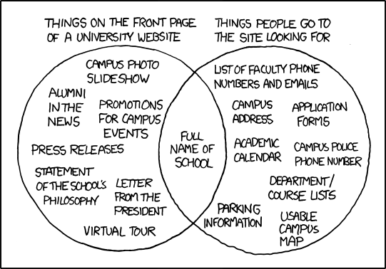
    Your biggest UX challenge for the website redesign will likely be the sprawling business needs of the university. While most schools operate on an altruistic mission, that mission is fueled by stakeholder buy-in, marketing success, and brand awareness. These goals help ensure the success of a school but consider: are business goals equatable to the goals of the website?

    venn diagram of content on a university homepage versus what people are looking for
    The classic UX divide of the university homepage.  Source: xkcd.com

    I love the above XKCD panel that illustrates implementation vs user needs. It captures the heart of the problem: universities often tailor their web content to promote themselves, which results in regular users struggling to find the content they need.

    Balance business and user needs by regularly sharing user data with stakeholders. This will build empathy and keep your project on a user-centered track. Another project goal will be to make sure certain parts of the site (such as requests for information or scheduling a campus visit) are easy to locate and understand.  Prioritize users who are interfacing with your brand and services for the first time. What’s good for the novice is often good for the expert. Let’s move onto the research plan.

    Website Research Plan at a Glance

    Project TypePhaseResearch Methods
    University WebsiteDiscoveryStakeholder workshops


    Card sorts

     Design5 Second tests
     Post-launchFeedback evaluation

    University Website Redesign – Discovery Phase

    Stakeholder Consensus Workshops

    If there are multiple agencies, programs, or departments represented on the project, then plan for a stakeholder workshop to gather vital information about various needs and beliefs. The activities in this workshop might include a Q&A or user persona creation. Our team has had great success with moderated brainstorming, and affinity mapping activities. The purpose of these exercises is to build the overall mission of the project. Use the activities to keep the conversation focused on what needs to be conveyed to visitors and what actions to encourage.

    [Affinity Diagrams are groupings of stakeholder ideas to identify patterns, themes, and priorities]

    You may hit some political bumps—but don’t worry! It’s far better for this conflict to happen early in the project rather than right before launch. Use this as an opportunity to build trust and understanding with your important stakeholders.

    Card Sorts

    University websites have a large variety of content, meant to reach several audiences. Set aside time for your information architecture and content strategy. Perform a card sort of your information designs with representative users and pay close attention to the results. These tests are best done in person. You can gather qualitative comments by asking questions and encouraging your participants to think out loud. Caution: this activity is meant to smooth snags in the overall fabric, not statistically represent users as a whole. Don’t let a thoughtful user comment pass you by, but also be careful not to redirect the project to suit the needs of a single participant opinion.

    University Website Redesign – Design Stage

    5 Second Tests

    Plan for some type of regular design feedback. Try a 5 second test, which shows a user the design for 5 seconds and then asks them questions about their perception of the design. This will help you and your design team understand how clear your primary messages are.

    Here are some great questions to ask after exposing them to a single page design:

    • Describe the page you just saw.
    • What is the purpose of this page?
    • What are some actions you could take on this page?

    Of course, you can get a lot more specific depending on the page’s contents and what you hope to learn. These tests are straightforward, inexpensive to perform, and can yield fascinating results. Don’t overthink it!  With a small sample size, you might end up with a wide variety of results—but these honest and unbiased reactions from real users are pure gold to researchers. Put the right amount of emphasis on the results and have fun learning!

    University Website Redesign – Post-Launch Phase

    Intercept Surveys

    In my humble opinion, I think people spend way too much time deciding which feedback widget to add to their site and not enough time thinking about the data it will generate or how they will use that data in the future. Plan your surveys to catch your users at a crucial point in their journey with your university website, like after submitting information requests. This type of “intercept survey “ will help you make better assessments about needs and behaviors. But be careful—this survey isn’t simple analytic code that you can slap down and forget about. Like all research initiatives, it requires deliberation and attention.

    Use feedback surveys dedicated to ongoing evaluation and have confidence about the research question you’re asking. Keep in mind that we are all over-surveyed and under-rewarded. Your users are no different. Be brief and meaningful with your survey, letting the users know how their effort is benefiting a larger community.

    Example 2: Student/Faculty Resource Portals

    An online/resource portal on a university website is accessed by a captive group of dedicated users who are determined to complete their task. This single fact should drive your entire perception of its design. Personally, I find this type of UX research particularly exciting.

    For the purpose of this blog we will say that a resource portal is: A view that serves as a hub to resources that student or faculty members need to fulfill their vocational role.

    Because portals are able to complete a wide variety of tasks, they can suffer from poor organization. And—since each portal is different—comparing them to similar systems will only take you so far. It will be crucial to understand user motivation and high-level goals in order to develop a resource portal that is simple and accessible.

    User research is at the heart of this journey. Spend time getting to know the motivations and struggles of your user segments and the rest of the resource portal project will run smoothly.

    Research Plan at a Glance

    Project typePhaseResearch Method
    Student/Faculty Resource PortalDiscoveryScenario Identification
     DesignPrototype Testing
     Post-launchSummative Evaluation

    Resource Portal – Discovery Phase

    Scenario Identification

    Begin by listing out all the scenarios that would bring a student or faculty member to your university website. If you are interested in learning how to identify new needs, gather feedback from users themselves to prioritize those items. There are many ways to do this, either with stakeholders or by gathering the information with a card sort or survey.

    This simple activity is critical to building a meaningful resource portal. Once you have a prioritized list of real-life scenarios, it will be easy to dig into the user’s goals, tasks, and expectations. From there, you and your team will be poised to create a rough prototype inspired by your informed assumptions.

    Resource Portal – Design Phase

    Paper Prototype Testing

    For a project as important as a user resource portal, I recommend testing your concepts as soon as possible. Consider a paper prototype test. Create a prototype of your concepts with whatever materials are available to you (such as paper drawings or print outs). The only requirement is that your objects embody the ideas of your design team and project stakeholders.

    Explain the prototype to the user and ask them questions about how it works. Allow them to remove/add/change elements and explain their motivation. This last point is important! User motivation is more meaningful than the actions they take. As you perform these tests, record and report how users expected to complete the task. This will take more critical thinking than you might expect. We call these activities “participatory design”. It is sure to energize your team and give incredible purpose to your design decisions.

    Resource Portal – Post-Launch Phase

    Remedial Usability Evaluation

    While you may be tempted to focus solely on page analytics or help desk requests, I highly encourage project sponsors to re-evaluate the entire system and make sweeping changes to elements that aren’t working. It’s much cheaper to nurture and grow a system over time than it is to engage in redesign overhauls every 2 years.

    For remedial efforts, have a handful of users participate in usability testing sessions and work to minimize problems that may have developed over time. Should problem areas arise, you can take a focused look at those elements and refine the system.

    Conclusion

    Ultimately, higher education UX research has much in common with a great university experience: the learning process is ongoing and there are tons of study options. Because there are dozens of ways to gather valuable user feedback that will help refine your project vision, it is best to approach UX research with your goals in mind.

    Maintain a birds-eye view of the project’s desired outcomes, and you will be better-prepared to implement your research. Choose methods that will work to establish consensus among key team members and will uncover the most valuable insights to help answer your questions. You’ll have to be clever to pull off great design research, but that cleverness will set you apart from the pack as a caring and enjoyable brand to engage with.

  • The Pain Point: How to Market Honestly without Being Negative

    Why Do We Even Have Conflict?

    Storytelling 101: conflict is essential to a good story. There’s a protagonist, she wants something, but something else gets in the way. That, in a nutshell, is conflict.

    The trouble is, many people who ask writers for marketing stories don’t like conflict. It’s uncomfortable. You take a person, organization, or business that we all like, identify with, and want to succeed. Then you tell me that bad, unpleasant things happened, causing this person, organization, or business to suffer. In marketing narratives, we call these pain points—those specific vulnerabilities and setbacks which a business had to overcome if they wanted to survive.

    So if conflict and pain points are uncomfortable and negative, why not minimize or even do away with them? It’s easier than you think. For example, here are the stories of some of last year’s Oscar winners with conflict removed:

    1. THE BIG SHORT
      Big_Short
       
    2. MAD MAX: FURY ROAD
      Mad_Max_FR
       
    3. THE REVENANT
      the_revenant_SD1_758_426_81_s_c1
      (via drafthouse.com)

    Why Stories Need Conflict

    If you went and saw a movie like these three, you’d want your money back. Why? Because these stories aren’t compelling. No one wants to watch a hero at the height of his powers win an easy victory. Instead, we’re drawn to vulnerability, struggle, and hardship—there’s something cinematic and powerful in that moment when the protagonist of a story is truly at a loss, and we the viewers aren’t sure he’s going to make it.

    Why? Because we all know what it’s like to struggle. There’s a basic, human connection in seeing likable characters at their lowest point, and a raw, uncompromised joy at seeing them turn it around and—against all odds—win.

    And the same principle applies in case study stories. Ironically, qualities that make a company more admirable in real life—like expert management, profitability, or efficiency—can quickly make an audience disregard their stories. It’s not that we hate winners; it’s that dominant companies who never struggle make for boring reading.

    In an age of social media chest-beating and self-congratulating advertisements, honest vulnerability is powerful. We the audience are suddenly trusted with intimate details, let into the inside story of what was at stake. And unlike the movies, this story is REAL. When we read about a real company who faced real hardship at risk of losing everything, we lean forward and think: “This can’t be how it ends. How are they going to turn things around?”


    How to Avoid Excessive Suffering

    A classic critique here is “But isn’t this kind of story too negative?” It CAN be, if the story ends before the company overcomes its challenges. After all, a story that introduces conflict and then forces us to watch while the conflict crushes the protagonist into submission is an even worse story than the boring victory described above. However, telling the story of how a company prevails over its challenges with the help of better technology and management IS a story worth telling—it’s the classic “Come From Behind” victory rather than “Starting Behind and Staying Behind” tragedy.

    This is when vulnerability and being honest is critical, because this is when we move past vague, generic negativity and into a specific, tangible place of truth. The entire world might not get better, but this one person/company could and did (and if they can, then maybe everyone who watches this has a shot.).

    Now that your audience is leaning forward and attached to your story, just tell them how you helped this company win. And keep the victory personal—numbers and improvement stats are vital to a winning story, but including a short anecdote about when it all came together will make your narrative even more memorable. If this echoes the original “I don’t know if they’re going to make it” moment, all the better.

    Pain points are part of life, and your audience knows it. But with a real, vulnerable narrative, pain points can be what make your story powerful, effective, and well-worth sharing.

  • How WordPress Empowered Campbell’s Higher Ed Brand

    Ask any brand marketer why brand consistency is important and you’ll get a variety of answers. Most boil down to how a consistent brand allows you to convey your values, manage perceptions, and grow within a framework. When your brand or messaging is inconsistent, there can be an erosion of trust or confidence from your audience. Over time that results in negative returns from any promotional efforts—which is why more and more higher education institutions are taking branding seriously.

    66% of colleges have spent more than $100,000 on brand strategy development.

    The Chronicle of Higher Education

    Beyond the creative challenges associated with higher ed branding, there are significant technical hurdles to portraying a united brand on a university website with multiple programs and schools. That in mind, this blog post will use my company’s recent collaboration with Campbell University as a working example of how we overcame the technical roadblocks in Campbell’s way. We met the issues Campbell University faced with WordPress’ multi-site installation to give Campbell the digital platform they needed so they could freely focus on performing their best brand work.

    Campbell University and the Need for a Shared Framework

    First, some background about Campbell University’s legacy site: the university had a website for their main campbell.edu property, and each individual school at Campbell. The central Marketing Communications (CMC) team had limited influence over the content produced by each school and whether it complied with Campbell’s branding or not.

    Legacy site for the Campbell Law School
    Notice the differences between the sites for Campbell’s Divinity and Law Schools. We needed to unify the brand look across Campbell’s schools and programs.

    Legacy site for the Campbell Divinity School

    As you might imagine, this led to a confusing user experience because the look, feel, and tone of a Campbell.edu page could change substantially as you navigated across school sites. Campbell University’s Assistant Vice President of Communication and Marketing, Haven Hottel, described the legacy campbell.edu as “disjointed”:

    “The site was a collection of independent websites connected to a central university site. Beyond the top level, there was little visual and navigational consistency; two of our colleges and schools operated outside of the current CMS; and there was not a clear URL naming structure.”

    As Campbell’s partner for their site redesign, we wanted to change this situation by balancing university governance with empowering stakeholders across Campbell. This meant changing the web environment from every department having their own tool to everyone having a shared framework from which to produce content for their schools—content that had a universally-branded look and feel.

    The key to accomplishing this was a multi-site installation of WordPress. We built each school’s property as their own website within the global campbell.edu domain. This allows each of them to have their own space to produce content, style their pages, and generally retain the control they wanted. As for the CMC team, they are now able to utilize user permissions and workflows for content production within WordPress. This helps achieve their goals for content production and brand integrity. Now they can review and provide direction for all the content their stakeholders produce as well as how pages are styled going forward.

    Chart of user roles and privileges
    By enabling content managers across Campbell to designate user roles and privileges, we helped university stakeholders contribute to their branded sites without going off-brand.

    This shared framework has brought together the CMC team and the content producers at the schools in a new way, and sets Campbell up for success going forward. The results so far have been on par with the original intention: freedom for all to contribute, but within the framework of the core brand.

    How We Set Campbell Up for Brand Success on WordPress

    Campbell’s client profile is unique. The CMC team planned to own the whole website and brand ecosystem going forward and support it for their constituents—the schools. Within this atmosphere, there were a number of objectives we wanted to achieve throughout the life of the project:

    • Position the CMC team as the project lead to their constituents.
    • Incorporate the CMC team as a part of the ABT team in all facets of production.
    • Give them the knowledge base needed to move forward.
    • Help secure traction at the highest levels of the university for the initiative.

    To achieve these objectives, we created processes and played roles newer to ABT. One process we implemented was “tearing down the wall” between the client and project teams: the CMC team were at our office weekly for all-day working sessions, participated in our huddles, reviewed work-in-progress, created some designs, and generally worked together with our experts all throughout the lifecycle of the project. In short, we operated as one team. This gave the CMC daily details on the project to communicate to their constituents while enabling us to move at a much faster pace than usual.

    We also have now created two permanent documents that go along with the product we built. The first is a product specifications document that outlines all facets of the websites’ functions. Typically we create a specs doc during most projects, but for this product we wanted to make sure it would live on permanently after product launch. The second is an instructions document for the CMS itself. These documents are referenceable by the CMC team, their constituents, and even the ABT team going forward as new features or people are introduced to the product. We continue to keep these documents current so the information is always relevant and useful.

    Lastly, we partnered with the CMC team to explain the “why” of this initiative at the highest levels of the university. We presented to the deans of Campbell University, explaining why this web redesign effort was important to their institution, its brand, and its success going forward. Providing an expert voice from an outside party can better position any client to engineer loyalty from their audience. By conducting this exercise early on, we helped earn credibility for the project to secure the proper participation along the way.

    The Right Strategy for Your Higher Ed Site

    homepage of campbell university
    The new global-minded look of campbell.edu helped unify the brand of every department in the university.

    The new Campbell.edu has been a big success for both incoming students and the university’s various schools and departments. As Hottel described:

    “The feedback from our campus units regarding the website transformation has been overwhelmingly positive. By approaching the project from a “global” perspective, the entire site maintains a consistent visual identity with site-wide structure for search and navigation.”

    No two universities’ challenges are exactly the same, and there are a myriad of solutions that could work for you. There may be a different technical roadblock standing in your way that we can help you overcome. After the success of ABT’s redesign of Campbell.edu, we look forward to partnering with more higher education clients to find the web technology and CMS design that works best for them. If you’re interested in working with ABT, we’d love to talk about your challenges and what technology ABT can provide so you can have the best possible foundation on which to succeed.

  • ABT Modernizes Site for NC Department of Revenue

    Atlantic BT is proud to announce the launch of the North Carolina Department of Revenue’s new website. A partnership that began in 2015 (as ABT was collaborating with NC.gov) has come to fruition with a stronger and more streamlined DOR site that provides easier access for both taxpayers and DOR staff.

    Because of the many rules and processes of NC tax policy, the restructuring of the DOR site required ABT to tackle complex situations with nuance and care. Our team conducted extensive research to ascertain the needs of taxpayers as well as internal users who maintained the site. This research led us to shift the web experience to focus on the tasks users wanted to accomplish on the site rather than the identity of the users themselves. This task-oriented approach became a defining characteristic of the project.

    User Research Provides Answers for State Government

    Using Tree Test Diagrams developed from an in-depth persona workshop, our designers created an ideal path for different users to follow when visiting the DOR site. The UX needed to be just as clear for a user looking for general information as it was to a taxpayer who had a specific issue to be addressed.

    Tree test example of NC tax return access
    This tree test shows possible user paths for checking the status of an NC tax return.

    Keeping this in mind, we migrated the site over to a new platform powered by Drupal. This gave internal users more autonomy and flexibility, making it easier to update the site as technology and tax laws changed. At the same time, Drupal enabled strong governance over the different internal users to ensure their updates fit the larger vision of the department. Redesigned information architecture, which was now data-informed rather than data-driven, also established much needed clarity to enhance the user experience across the site.

    New Offerings on NCDOR.gov

    Everyone has a story of a tax situation gone awry. Our Research Manager Randy Earl shared one that he experienced while he was working on this project:

    “Resolving complex tax issues can often feel like being trapped in an endless loop of frustration,” he said. “Finding the right information and understanding the process can make all the difference; that’s why making this site stronger and more accessible for taxpayers is so important.”  

    The new user interface for NCDOR.gov
    Data-informed information architecture powered this new user interface for NCDOR.gov.

    The new DOR site will now lead users exactly to where they need to be and create opportunities for tax issues to be remedied easily for everyone involved. Atlantic BT achieved this with:

    • A reorganized and modernized web interface with user-friendly access to essential pages.
    • A shared design platform with other NC Government branches for clarity and unity.
    • Mobile-friendly site capabilities.
    • Updated technology with the ability to maintain pace with ever-changing user needs and tax laws.

    Tax related stress is no joke. That’s why the DOR wanted to ensure that its new design prioritized the user, making the entire process as simple as possible and perhaps even enjoyable. Atlantic BT is proud to work alongside the DOR and looks forward to future collaborations to build NC.gov sites that support and empower the people of North Carolina.   Â